Every company, and website, needs a logo. Today, we’ve got a new one!

A VIP House
Property logos usually represent a house – original, right?
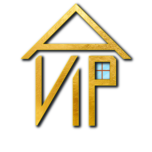
But, that doesn’t mean the house needs to be built in the same way! Our house logo integrates our brand – A VIP
Shorthand for Ashbourne VIP, our logo uses the A for a roof and the VIP to build to walls.
A window in the P really sells the house design, and adds some colour, too.
Just the start
I made this logo quickly in paint.net – a simple image tool for windows.
The logo still has a lot of potential for new designs, but it makes a great step towards our brand.
The message
The goal of our logo is to demonstrate the quality of our finished homes, with golden colouring.
The shadows behind help the image stand out against any background, give some depth, and if you want to get pretentious and artsy it could symbolise the old state of our houses being dark and dingy, before we fixed them up.


